Main hub: Visio Data Visualizer. Process mapping hub: Visio process mapping.
The Value Stream Lens (Pt. 2 of 3)
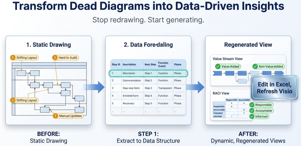
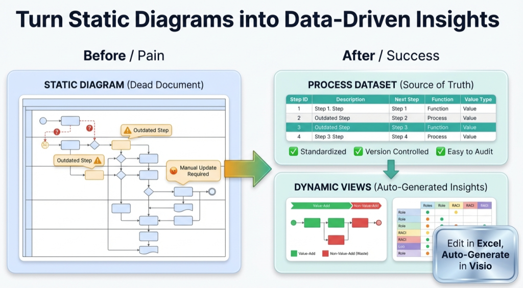
A value stream map is most useful when it stays current. The maintainable approach is simple: classify the process as data, then generate the value stream view from the dataset.
- Pt. 1: process diagram to process data
- Pt. 2: the value stream lens (this page)
- Pt. 3: one process model, many views
Why the value stream lens works
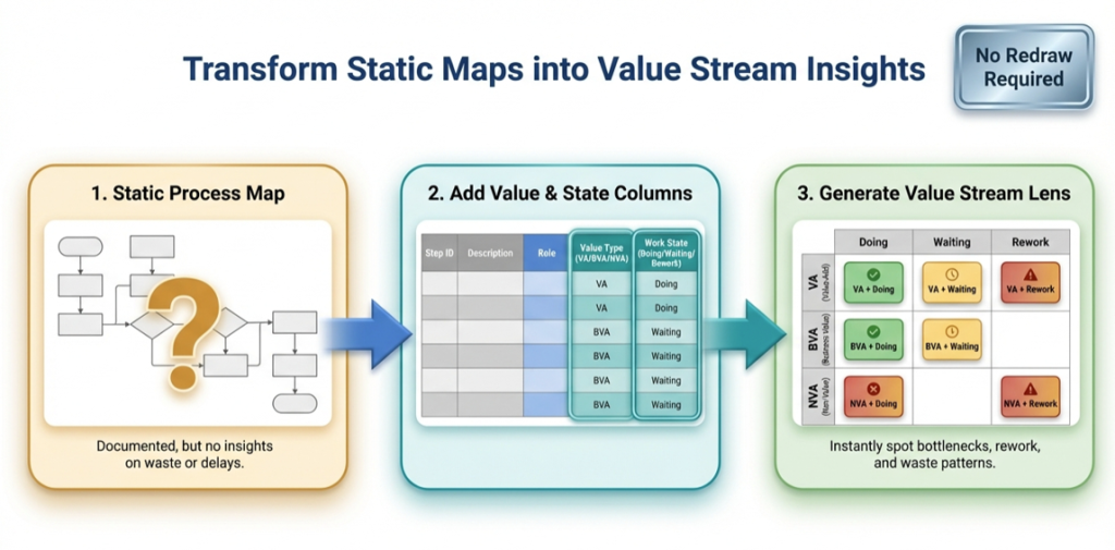
The value stream lens compresses complexity into a diagnostic pattern. Instead of debating the map step-by-step, the lens answers higher-level questions fast: where work waits, where rework happens, and where non-value work dominates.
Key idea: the process steps and connections remain the same. Only the viewpoint changes. That is how a value stream view stays maintainable.
For the practical “process as data” foundation, start with: Pt. 1 – process diagram to process data.
The two classifications
The value stream lens is built from two simple classifications. Acronyms are expanded here so the terms stay clear for mixed audiences.
| Classification | Values | What it means |
|---|---|---|
| Value classification |
VA – Value-Added BVA – Business-Value-Added NVA – Non-Value-Added |
VA changes the product or service in a way the customer would pay for. BVA is required for the business (compliance, finance, safety), but not value from the customer’s perspective. NVA is waste and is a direct elimination target. |
| Time mode classification |
Active Waiting Rework |
Active is real work happening. Waiting is queued, blocked, idle, or pending approval. Rework is redo due to defects, missing inputs, or unclear acceptance criteria. |
Lens pages live under the process mapping hub: process lenses overview.
How to apply the lens to a dataset
The maintainable workflow uses 1 canonical dataset and a derived lens dataset. The canonical dataset keeps stable Step IDs and stable connections.
- Start with the canonical dataset. If a template is needed, use: Data Visualizer template.
- Prove the round-trip with 20 steps. Import, fix formatting, then change 1 row and re-import.
- Create a lens dataset (copy or derived table). Keep Step IDs and Next Step IDs unchanged.
- Reclassify for the value stream lens. Set Function to VA/BVA/NVA and set Phase to Active/Waiting/Rework.
- Render the value stream view in Visio Data Visualizer. Import the lens dataset to generate the lens diagram.
- Quantify in Excel. Pivot counts by lane, zone, and step type to prioritize action.
If imports fail, use: Data Visualizer import troubleshooting.
How to read the 3 x 3 grid
The 3 x 3 grid is the point. The pattern tells the story without reading every step.
Common diagnostic patterns
- VA + Waiting – constraint and queue time blocking value work
- VA + Rework – quality, definition, or input completeness problems
- BVA + Waiting – bureaucracy, gating, unclear decision criteria
- NVA – elimination targets (especially if repeated or looped)
Typical high-ROI actions
- Reduce approvals and define decision criteria
- Remove batching and limit WIP (Work In Process)
- Clarify acceptance criteria to reduce rework
- Standardize handoff inputs to prevent “ping-pong” loops
- Automate BVA work only after it is stabilized
Even if the diagram is dense, the dataset makes the insight easy to summarize. The 3 x 3 counts become the executive readout.
Metrics to quantify in Excel
Once the lens exists as data, Excel becomes the measurement layer. These are the fast, decision-useful metrics to compute first.
| Metric | What it answers | How to approximate from the dataset |
|---|---|---|
| Lead time vs cycle time | How much time is waiting vs doing | Classify steps as Active vs Waiting, then compare totals |
| Flow efficiency | How much time is value work | (VA Active time) divided by (total time) |
| PCE – Process Cycle Efficiency | How much time is real work | (Active time) divided by (total time) using your time estimates |
| Rework concentration | Where defects and missing inputs show up | Count steps classified as Rework, then break down by step type or owner |
| Handoff count | Where coordination cost is created | Count Function changes across connected steps |
Related: audit a Visio process map in Excel.
Common pitfalls
- Reclassifying Step IDs – Step IDs should remain stable across all lenses.
- Mixing value and time concepts – keep VA/BVA/NVA and Active/Waiting/Rework separate and explicit.
- Over-detailing too early – prove the workflow at 20 steps before converting a full library.
- Unclear definitions – publish short definitions for VA/BVA/NVA and Active/Waiting/Rework so teams classify consistently.
Dataset rules matter. For formatting constraints that prevent import errors, see: Data Visualizer dataset format.
Recommended next steps
Next post: Pt. 3 – one process model, many views.
FAQ
Is this the same as a traditional value stream map workshop?
The objective is similar (find waste, delay, rework), but the operating model is different. The lens is applied to a maintained dataset so the value stream view can be regenerated as the process changes.
What if the process map is too detailed for executives?
The dataset makes summarization easy. Even if the view is dense, the lens counts by zone (VA/BVA/NVA crossed with Active/Waiting/Rework) provide an executive-grade story.
Do VA, BVA, and NVA need perfect agreement?
No. Definitions should be consistent enough for the lens to reveal patterns. The value comes from concentration: where waiting and rework cluster, and where non-value work dominates.
What usually breaks the workflow?
The most common breakpoints are unstable Step IDs, missing Next Step references, and TSV formatting issues. Use import troubleshooting.
Microsoft, Visio, and Excel are trademarks of Microsoft. This site describes an independent tool and is not affiliated with Microsoft.