Main hub: Visio Data Visualizer. Process mapping hub: Visio process mapping.
Diagram to data-driven insights in Visio
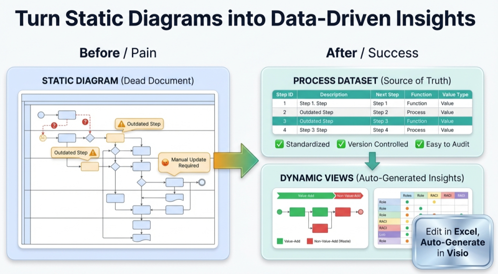
A process map is a picture until it becomes a dataset. Once the process is data, Excel can measure it, Visio can regenerate it, and improvement work stops being opinion-based.
If the goal is to analyze a diagram with artificial intelligence (AI – artificial intelligence), see: AI Visio diagram analysis.
The 5-question test
If a process map cannot answer these questions quickly, it is not a model yet.
- How many handoffs exist end-to-end?
- How many approvals exist?
- How many rework loops exist?
- Where does work wait the longest?
- What % of steps are value-added versus waste?
The objective is not “more documentation”. The objective is “decision-ready visibility”.
Why “pretty diagrams” still fail
Most process maps go stale for 3 predictable reasons:
- Updates are expensive. Editing shapes is slow, fragile, and inconsistent.
- Variants multiply. Multiple versions drift and nobody trusts the “official” one.
- Analysis is limited. A picture is hard to count, filter, compare, or transform.
A diagram can be correct and still be useless if it cannot be maintained and measured.
Model vs view
This distinction is the unlock:
| Concept | What it is | Why it matters |
|---|---|---|
| Model | The dataset (table) of steps and connections | It can be validated, versioned, governed, and analyzed |
| View | A diagram generated from that dataset | It can be regenerated whenever the data changes |
For the exact dataset structure, see: Data Visualizer dataset format.
The insights a dataset unlocks
Once the process is in a table, a real analysis loop becomes possible. Excel can do the work that diagrams are bad at.
Start with this page if “Excel-first analysis” is the goal: audit a Visio process map in Excel.
What becomes measurable
- Handoffs – count Function changes across connected steps.
- Approvals – tag steps and pivot by type and owner.
- Rework loops – detect Next Step references that point backward.
- Queues – add a Waiting flag and quantify delay points.
- Automation targeting – classify steps by automation potential and quantify the pipeline.
Why this is AI-friendly
AI tools are far more reliable with structured tables than with screenshots. A dataset can be summarized, checked, and compared. A picture cannot.
Related: AI diagram analysis.
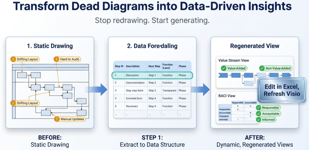
How to turn a diagram into a dataset
This is the shortest path that works for most teams. The objective is a clean round-trip: data imports to Visio, a data edit updates the diagram, and the workflow becomes maintainable.
- Start with a template. Use a known-good structure so headers and rules are correct: Data Visualizer template.
- Convert a 20-step slice first. Capture steps as rows with stable Step IDs and Next Step IDs.
- Import into Visio Data Visualizer. Fix formatting issues until it imports cleanly. If needed: import troubleshooting.
- Prove the round-trip. Change 1 row (move a step to a different lane) and re-import. If the diagram refreshes correctly, the model is maintainable.
- Scale up. Expand from 20 steps to the full process, then build analysis fields and lenses.
If the source diagram is a swimlane, start here: swimlane diagrams hub.
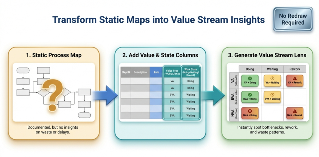
How 1 model produces many views
Once the process exists as data, different “views” can be generated without redrawing. A view is a controlled reclassification of the dataset fields.
| View | How it is generated | Why it helps |
|---|---|---|
| Operational swimlanes | Function = team or role | Shows flow and handoffs |
| Value stream lens | Function = VA/BVA/NVA, Phase = Active/Waiting/Rework | Makes waste and delay visible |
| Governance lens | Function = Accountable role (RACI – Responsible, Accountable, Consulted, Informed) | Clarifies ownership and decision rights |
Related pages: value stream mapping in Visio and RACI in Visio.
Recommended next steps
Conversion path: validate the workflow with Lite, then scale with Standard.
FAQ
What does “data-driven insights” mean in process mapping?
It means the process can be measured from a dataset: handoffs, approvals, loops, counts by owner, and lens classifications. Instead of debating the map, the team can count and validate.
Is converting a diagram to a dataset a 1-time effort?
The conversion itself is typically a 1-time effort per process map. After that, maintenance becomes dataset edits and refreshes, not redraw work.
What is the fastest way to validate the approach?
Convert 20 steps, import successfully, then change 1 row in the dataset and re-import. If the diagram updates cleanly, the process is maintainable.
What usually breaks the import?
Blank TSV rows, duplicate Step IDs, Next Step IDs that point to missing steps, invalid Shape Type values, or tab formatting issues. Use import troubleshooting.
Microsoft, Visio, and Excel are trademarks of Microsoft. This site describes an independent tool and is not affiliated with Microsoft.