Main hub: Visio Data Visualizer. Process mapping hub: Visio process mapping.
Turn a process diagram into process data (Pt. 1 of 3)
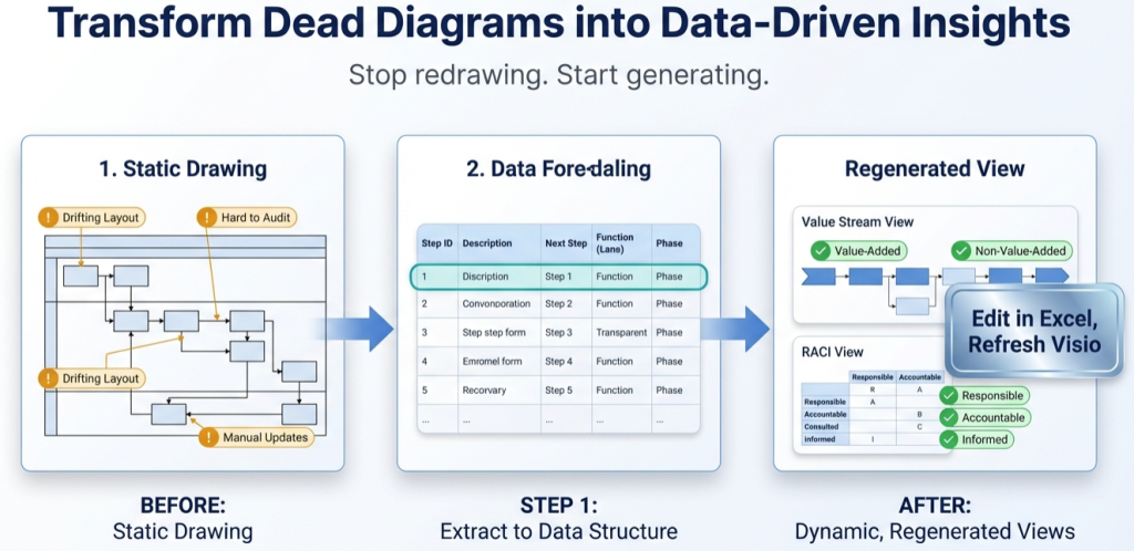
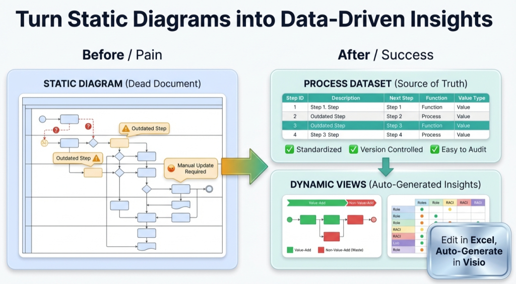
Every process diagram already contains a dataset. The steps are the rows. The arrows are the connections. The lanes are the owners. Once the process is a table, Visio becomes a renderer and Excel becomes the analysis engine.
- Pt. 1: process diagram to process data (this page)
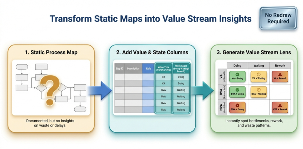
- Pt. 2: the value stream lens
- Pt. 3: 1 process model, many views
What “process data” means
“Process data” is a structured table that describes the process in a way tools can validate and regenerate. It is not a transcript and it is not a screenshot.
The purpose is simple: make updates cheap and analysis normal. If updates require redraw work, the process map will drift.
If the starting point is a swimlane diagram, use the swimlane hub: swimlane diagrams.
Minimum fields that matter
Visio Data Visualizer diagrams can be generated from a TSV (tab-separated values) dataset. The core idea is 1 row per step and stable IDs for connections.
| Field | What it does | Why it matters |
|---|---|---|
| Process Step ID | Unique identifier for each step | Enables stable connections and change tracking |
| Process Step Description | Text inside the shape | Keeps the map readable and consistent |
| Next Step ID | ID(s) of the next step(s) | Defines arrows and branching |
| Shape Type | Start, Process, Decision, End | Keeps diagram semantics consistent |
| Function | Lane owner (role, team, or system) | Creates swimlanes and enables handoff analysis |
| Phase (optional) | Stage or lifecycle column | Enables phased swimlane layouts and stage analysis |
| Connector Label (optional) | Text on arrows | Useful for clarifying branches |
For the exact field rules and constraints, see: Data Visualizer dataset format.
Rules that prevent import failures
- No blank rows in the TSV file (including at the bottom).
- Every Process Step ID is unique.
- Every Next Step ID exists as a Process Step ID somewhere in the file.
- Branching uses comma-separated IDs with no spaces (example: 040,050).
- Step IDs remain stable even if descriptions change.
- Lane names stay consistent (avoid Ops vs Operations drift).
If an import fails, start here: import troubleshooting.
The 20-step round-trip test
The goal is not to “convert the entire enterprise process library”. The goal is to prove the workflow is maintainable.
- Convert 20 steps from a real diagram into the dataset template.
- Import successfully into the cross-functional Data Visualizer template.
- Change 1 row (move 1 step to a different Function lane).
- Re-import and confirm the diagram updates correctly.
If that works, the process map is now a model. If that does not work, the dataset rules need to be tightened until it does.
If a template dataset is needed, use: Data Visualizer template.
Recommended next steps
Next post in the series: Pt. 2 – the value stream lens.
FAQ
Is process data the same as a process mining event log?
No. Process data in this context is a maintained model of the intended process captured as a dataset. Process mining uses system event logs to discover how work actually runs. The dataset approach can complement mining by creating a clear “model and views” layer.
Does process data replace Visio?
No. Visio remains the renderer. The difference is that the diagram is generated from a dataset instead of drawn and maintained by hand.
What is the fastest way to know if this will work for a real diagram?
The 20-step round-trip test: import from data, change 1 row, re-import, confirm the diagram updates correctly.
What usually breaks the import?
Blank TSV rows, duplicate Step IDs, Next Step IDs that point to missing steps, invalid Shape Type values, or tab formatting issues. Use import troubleshooting.
Microsoft, Visio, and Excel are trademarks of Microsoft. This site describes an independent tool and is not affiliated with Microsoft.