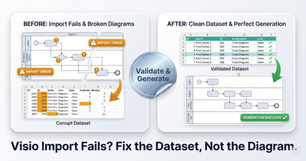
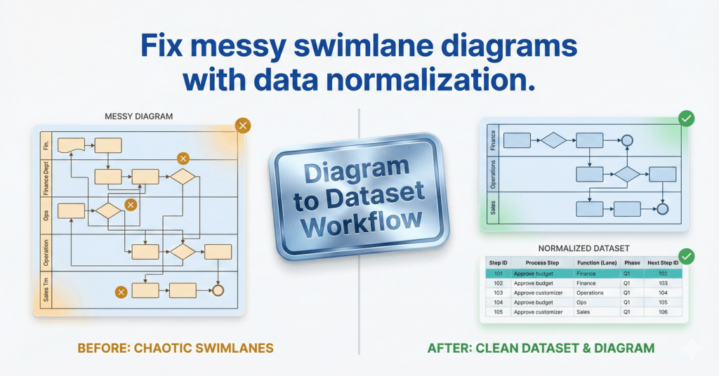
Swimlanes as Data: Normalize Function Data (Post 2)
Swimlane diagrams break when lane names drift. This guide shows how to normalize Function values with a canonical lane list, alias mapping, and Excel validation so Data Visualizer imports stay predictable and measurable.
Swimlanes as Data: Normalize Function Data (Post 2) Read More »